
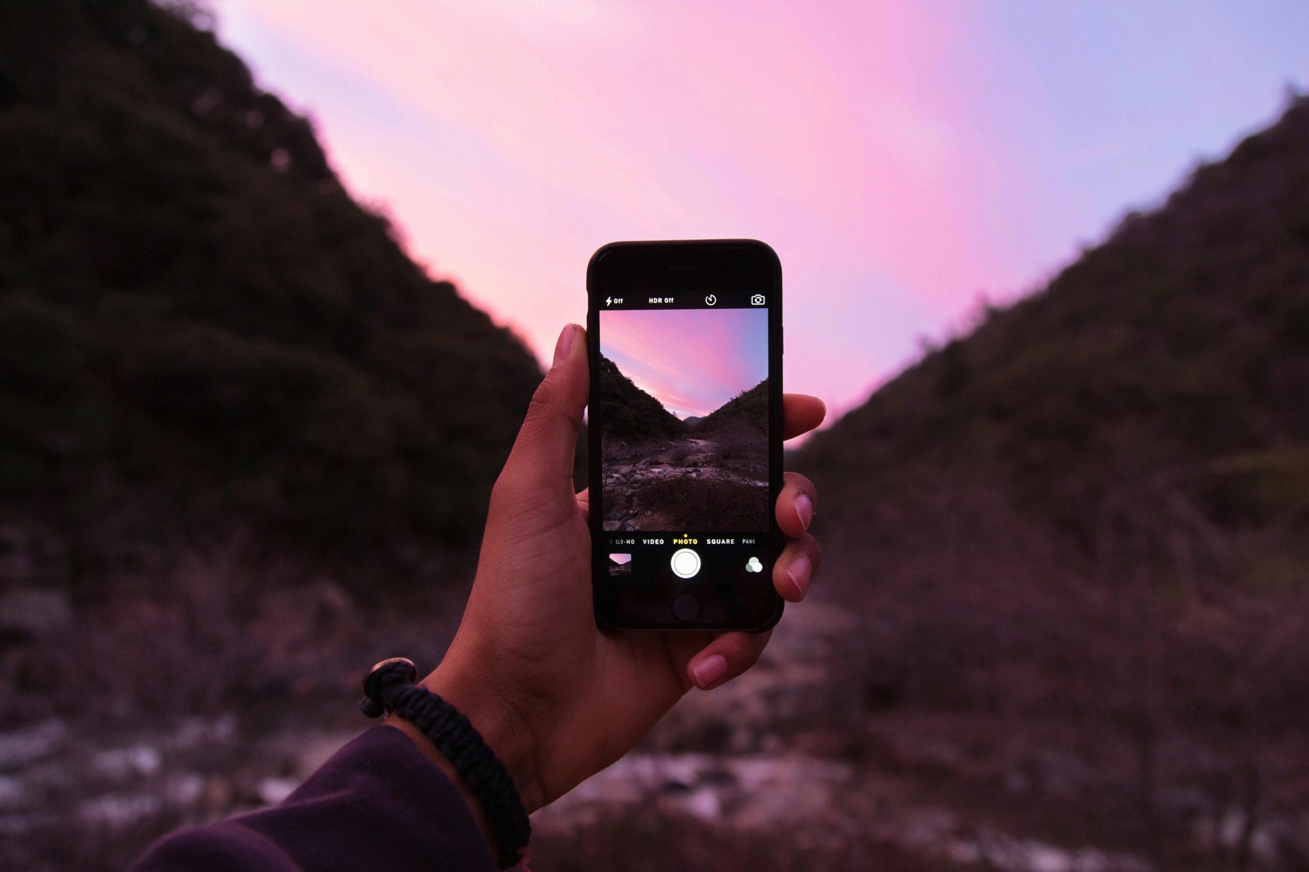
ZonaJakarta – Did you know your iPhone can take professional-looking photos without a DSLR or complicated software?
Whether you’re using an iPhone 13, 14, 15, or the newest iPhone 16, your phone already has the tools to capture amazing shots and even add beautiful color grading—aka those cool, moody or warm tones that give photos “a vibe.”
In this guide, we’ll go through some photography tips and how to color grade your photos right from your iPhone, step by step. No stress, no jargon—just clear, friendly help.
Part 1: Easy Photography Tips to Get Better Shots
1. Use Grid Lines to Frame Your Shot
Go to Settings > Camera > Grid and turn it on. This helps you follow the Rule of Thirds—placing your subject off-center for a more balanced and natural-looking photo.
2. Use Natural Light When Possible
The best lighting is free! Shoot during:
- Golden hour (just after sunrise or before sunset)
- Soft daylight (cloudy days are great too!)
Avoid harsh overhead lights or bright sun that causes hard shadows.
3. Tap to Focus & Adjust Exposure
Before you snap, tap on the subject to focus. Then, slide your finger up or down to make the photo brighter or darker. This helps set the mood before editing!
4. Try Portrait Mode for Depth
In the Camera app, swipe to Portrait mode for a blurred background effect. It’s perfect for people, pets, or even product shots.
Part 2: How to Color Grade Photos on iPhone
Color grading = changing the tone and mood of your photo. You can do this without any extra apps—just using the iPhone Photos app. Here’s how:
Step-by-Step: iPhone Photo Editing Tutorial
1. Open the Photos app and choose the photo you want to edit.
2. Tap Edit in the top right.
3. Use the slider tools at the bottom:
- Exposure: Makes the image brighter or darker.
- Brilliance: Adjusts shadows and highlights for more depth.
- Contrast: Makes lights lighter and darks darker.
- Saturation: Boosts colors.
- Warmth: Adjusts the color temperature. Add yellow for warm tones, blue for cool tones.
- Tint: Adds green or pink tones—great for creative looks.
- Vibrance: Subtler version of saturation—good for skin tones.
4. Adjust slowly—tiny tweaks go a long way!
Bonus Tip: Use Filters Smartly
After adjusting manually, you can also scroll through Filters (in the same Edit menu). Try:
- Vivid Warm – for cozy golden vibes
- Dramatic Cool – for moody blues
- Mono or Silvertone – for black & white styles
Pro tip: Use filters after basic adjustments for better results.
Optional: Use Editing Apps for More Control
If you want even more precise color grading, try these free apps:
1. Lightroom Mobile (great for presets and detailed editing)
2. VSCO (popular filters and manual tools)
3. Snapseed (advanced tools like Selective Editing)
4. Darkroom (iOS exclusive, very user-friendly)
Color Grading Mood Ideas
Color grading isn’t just for professional photographers. With just a few taps in your iPhone’s Photos app or a simple editing app, you can give your photo a whole mood. Whether you’re aiming for cozy autumn tones or cool film vibes, this guide is here to help.
1. Warm & Cozy
Perfect for sunset, lifestyle, or fall photos.
Settings to adjust:
- Warmth: +20 to +40
- Saturation: +10 to +20
- Shadows: slightly darker
- Vignette (if available): for a soft outer fade
Great for: Autumn leaves, golden hour portraits, café scenes.
2. Cool & Cinematic
Think blue-toned, calm, and dramatic—like a movie still.
Settings to adjust:
- Warmth: -20 to -40
- Contrast: +15
- Tint: +10 to add a purple-blue tone
- Highlights: lower slightly
Great for: Rainy days, urban street shots, nighttime.
3. Soft & Dreamy
Makes your photo look light, airy, and magical.
Settings to adjust:
- Brilliance: +20
- Highlights: lower
- Saturation: slightly lowered
- Warmth: +10 (for a dreamy pastel tone)
- Add a slight blur or glow effect in apps like Snapseed or Lightroom
Great for: Skies, morning shots, portraits with soft lighting.
4. Vintage Film Look
Old-school vibe, like photos from the 70s or early 2000s.
Settings to adjust:
- Saturation: -10 to -20
- Warmth: +15 to +30
- Grain: Add via Lightroom or VSCO
- Fade: Slightly raised blacks or shadows
Great for: Street shots, family photos, lifestyle scenes.
5. Muted Minimalist
Desaturated and clean, often used in aesthetic feeds.
Settings to adjust:
- Saturation: -20
- Contrast: +10
- Warmth: balanced (or slightly cool)
- Shadows: slightly lifted
Great for: Flat lays, modern interiors, outfit shots.
6. Moody Dark Tones
Dramatic, rich, and intense. Great for serious or emotional vibes.
Settings to adjust:
- Exposure: lower
- Contrast: high
- Saturation: medium to high (especially for reds and greens)
- Vignette: add to focus the center
Great for: Forests, nighttime portraits, dramatic skies.
7. Golden Hour Glow
Brings out that warm, late-afternoon sunlight vibe.
Settings to adjust:
- Warmth: +30
- Saturation: +20
- Brilliance: +10
- Shadows: softened
Optional: Add slight lens flare in an app like Snapseed
Great for: Portraits, backlit photos, nature shots.
Final Words For The Mobile Photography Enthusiasts:
Color grading is like adding emotion to your photo—it sets the scene, the story, and the vibe. And with just your iPhone, you can create beautiful looks without being a pro.
Your iPhone is more powerful than you think—and with just a few simple settings and tweaks, your photos can look polished, professional, and full of personality. Whether you’re sharing on Instagram, keeping memories, or building a creative portfolio, good composition + great color = magic.
So next time you snap a photo, give it a little mood makeover. Whether you’re into clean, cinematic, soft, or dramatic—your iPhone’s editing tools are more powerful than you think.
Happy editing! (*)